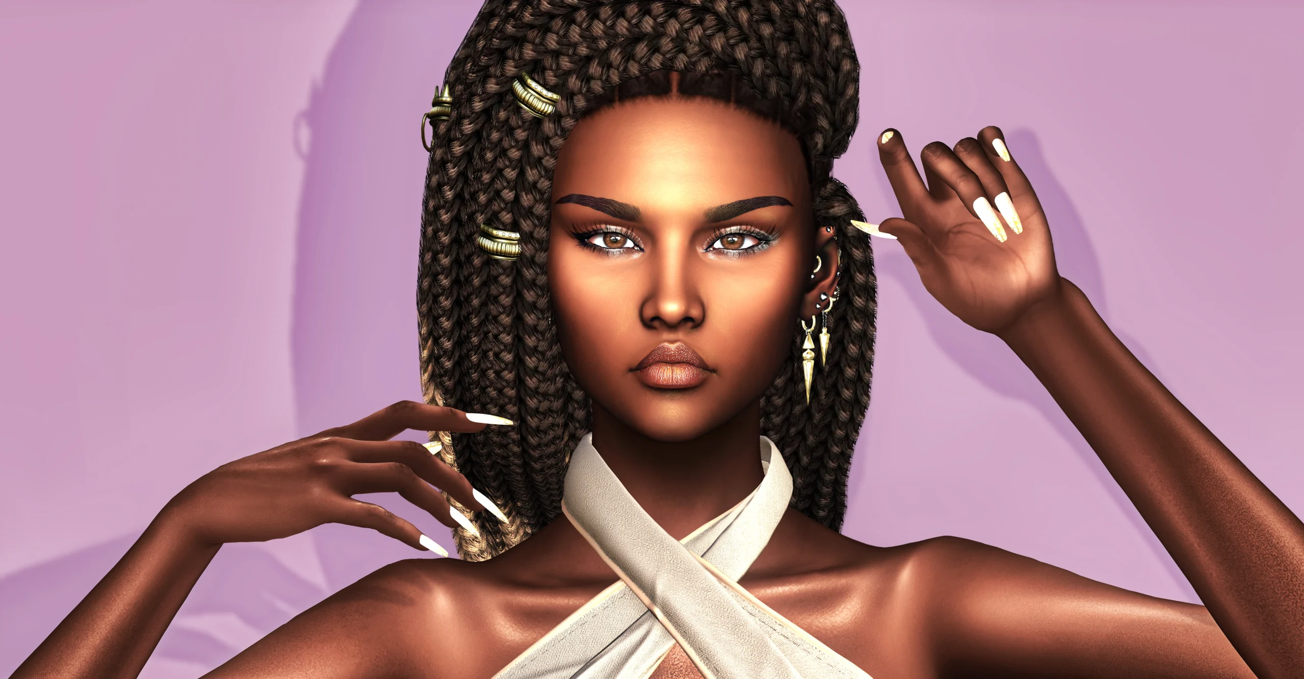

Lately I’ve found myself returning more and more often to one specific kind of work in Second Life: building avatars with darker skin tones. It’s not just a visual preference. It’s the kind of process that forces you to slow down and pay attention, because everything behaves differently. Light, contrast, even proportions feel more exposed, more sensitive to small decisions.
Zuri started from that space. Not as a finished look, and not as something meant to stand on its own, but as a base. Something stable enough to build on, without constantly having to fix underlying issues. I wasn’t interested in creating a strong identity right away. The goal was to create a believable starting point that could be shaped over time.
When working on skins like this, there are two directions that almost always lead to problems. One is pushing everything too flat, which removes any sense of depth. The other is going too far with shine, ending up with a surface that feels artificial rather than skin-like. What I tried to do here was stay somewhere in between, but not in a neutral way. The highlights are placed deliberately, mostly in the central areas of the face. The forehead, the bridge of the nose, the upper cheeks. The rest is more controlled. That difference matters, especially in close-up, because it gives the skin a more natural response to light.
The shape follows the same logic. It’s intentionally restrained. The features are regular, the proportions balanced, and the body sits somewhere in the middle range. This is not meant to be a final shape. It’s a working base. I’ve always found that overly stylized shapes might look strong at first, but they quickly become limiting when you try to adjust them. Here, the idea is the opposite. You start from something clean, and then you decide where to go.
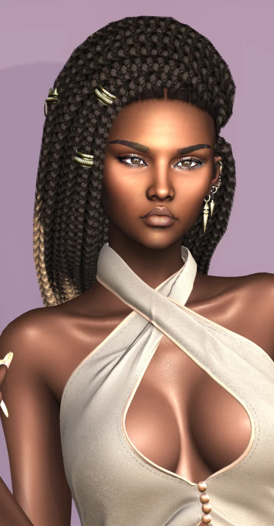
The skin comes in multiple tones, all compatible with Velour, which makes it easier to integrate into an existing setup. The darkest version, Mali, is also available as a free option in its Velour tone, offered in-store as a gift for those who join the She. store group. It’s a useful entry point into the system, and also the version that, in my experience, holds up best even without additional layers. It feels more complete on its own, more stable, and easier to work with from the beginning.
The lighter tones are different. They’re more open, but also more demanding. This is where I would strongly recommend introducing additional skin detail. Not randomly, but with intention. Subtle imperfections, light variations in tone, very fine texture overlays. Stores like Izzie’s in Second Life are specifically built for this kind of work, offering BOM skin details like freckles, soft blemishes, and micro variations that can shift the entire perception of the skin. Without that extra layer, the lighter tones can feel a bit too clean, almost unfinished.
There’s also a technical step that really shouldn’t be skipped. The Velour neck blend is essential if you want to avoid visible transitions between head and body. It needs to sit above the skin layer, and while it’s a simple adjustment, it’s one of those details that quietly determines whether the avatar holds up or not.
Inside the package, I included compatible ears and a lipstick. The lipstick was designed to add a slightly glossier finish to the lips, similar to what you see in the vendor. Interestingly, it behaves differently depending on the tone. On lighter skin, it works very well and adds a subtle, controlled highlight. On darker tones, it can feel a bit more pronounced, so it’s something I would suggest evaluating case by case, and replacing if needed.
Hair is where things open up again. One of the reasons I enjoy working with darker skin avatars is the range of combinations that become believable. You can move toward softer, more fluid styles, or into more structured textures like braids or natural afro-based looks. Both directions can work, but only if the material quality stays consistent with the skin. Overly glossy or overly rigid hair tends to break that balance quite quickly.
The outfit here is intentionally quiet. The focus stays on line and proportion rather than decoration. The pieces are from She., specifically the Amelie top and the Dahlia jeans, and they’re used in a way that supports the overall composition rather than dominating it. They define the silhouette, but they don’t compete with the face, which remains the focal point.
In the end, Zuri works best when it’s treated for what it is. Not a finished avatar, not a shortcut, but a base. The darker tone is immediate and convincing with minimal intervention. The lighter tones ask for more work, but they also allow for a more personal result.
And that’s really the point. Not what is already there, but what it allows you to build next.
All images are original in-world snapshots created by Avatar Studio unless otherwise stated. Avatar Studio is an independent editorial site and is not affiliated with Linden Lab or the featured brands.
